 Valem · Brand Repositioning
From hard to explain to the trusted bridge of the Unimed ecosystem.
The repositioning that aligned Valem's brand with 15+ years of operational maturity.
Segment
Supplemental health · exclusive Unimed benefits administrator
Scope
Research, positioning, verbal and visual identity
Audiences
Employees · Beneficiaries · Entities · Unimeds
Methodology
In-depth interviews, perceptual analysis and alignment workshops
Duration
6 months
Outcome
New brand architecture, visual system and voice guide
There's a type of company that only makes sense when someone from the inside is in the room. The operation is solid, clients trust them, the business grows — but the brand alone can't sustain any of it. Every presentation starts from scratch. Every proposal depends on someone explaining what the brand should be saying on its own.
Valem arrived at exactly that point: fifteen years of operation, medical governance, Unimed exclusivity — and a brand delivering less than the company was. As long as that didn't change, growing would mean re-explaining its own value in every conversation.
Leaving the category before redesigning the brand
Research with the four audiences revealed the same tension from different angles: confused beneficiaries, overburdened entities, Unimeds wary of the role of administrators. The entire market read the category as intermediation — and intermediation is exactly what no one can explain, defend, or pay more for.
The decision was to take Valem out of that category.
“just another benefits administrator — competing on volume and generic service claims”
“the exclusive bridge that translates the Unimed system into a clear, reliable, and responsible experience”
What was left behind: the volume competition, "humanized service" as a differentiator (everyone says that), and the idea that the project was about modernizing the logo. The problem was never aesthetic — it was categorical.
Applying the Noisy Method™, four attributes became the filter for every expression decision: exclusive, clear, reliable, human. Project rule: if a solution didn't feel like all four at once, it wasn't right for Valem.
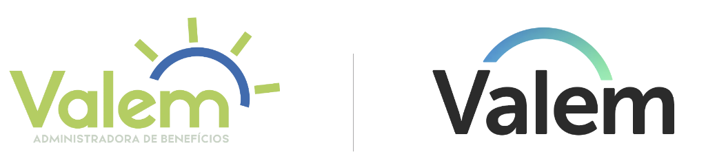
Examples of the old visual identity
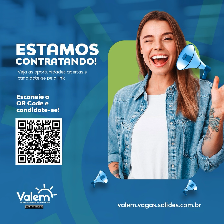
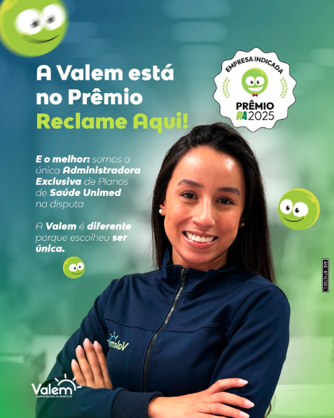
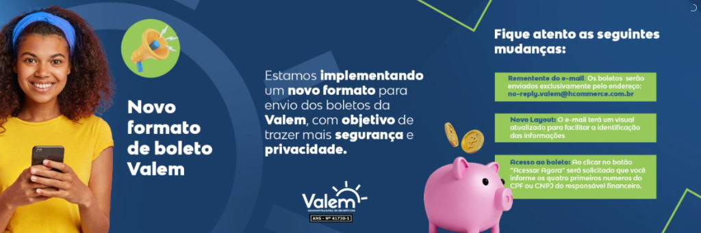

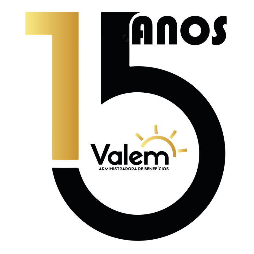
An identity that explains before it decorates


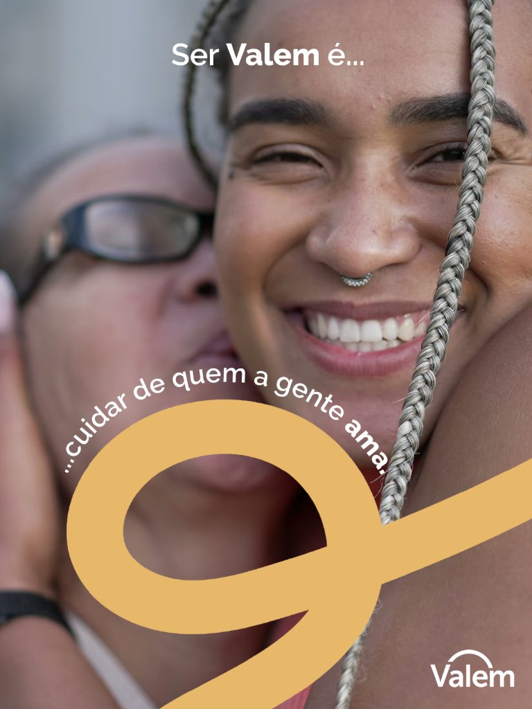
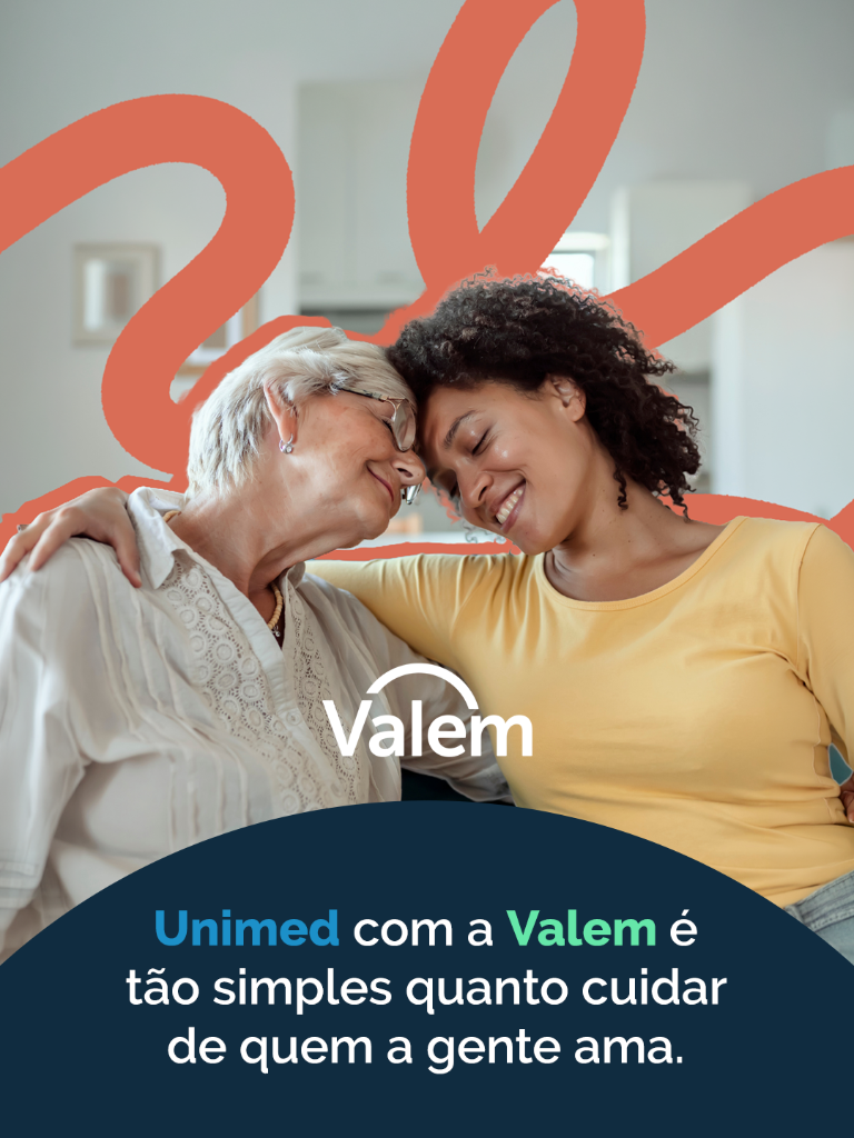
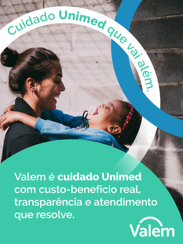




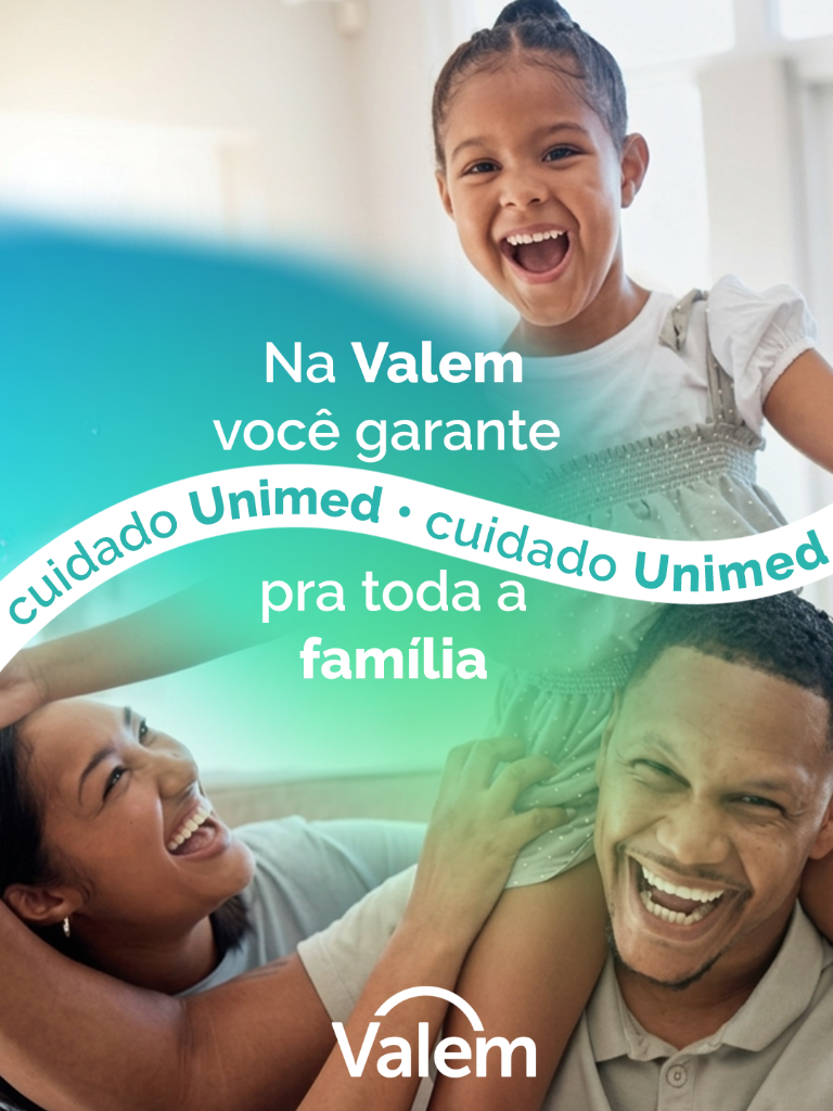
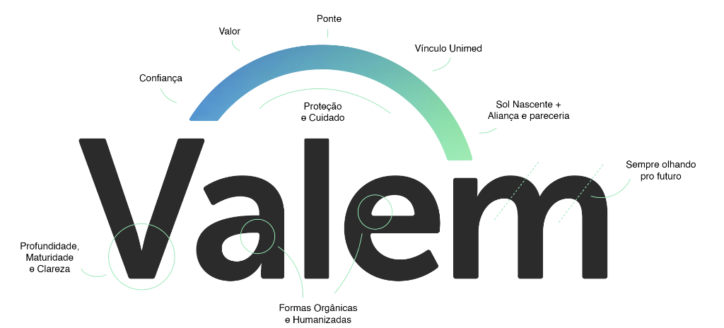
Visual system · palette
Visual maturity that communicates discernment before speaking — the aesthetic of someone who manages lives, not leads.
Typography · information architecture
Hierarchy that organizes what the sector hides in technical language. Clarity as a posture, not a style.
Signature · Unimed belonging
Structural institutional alignment with Unimed — visible belonging, not declared opportunism.
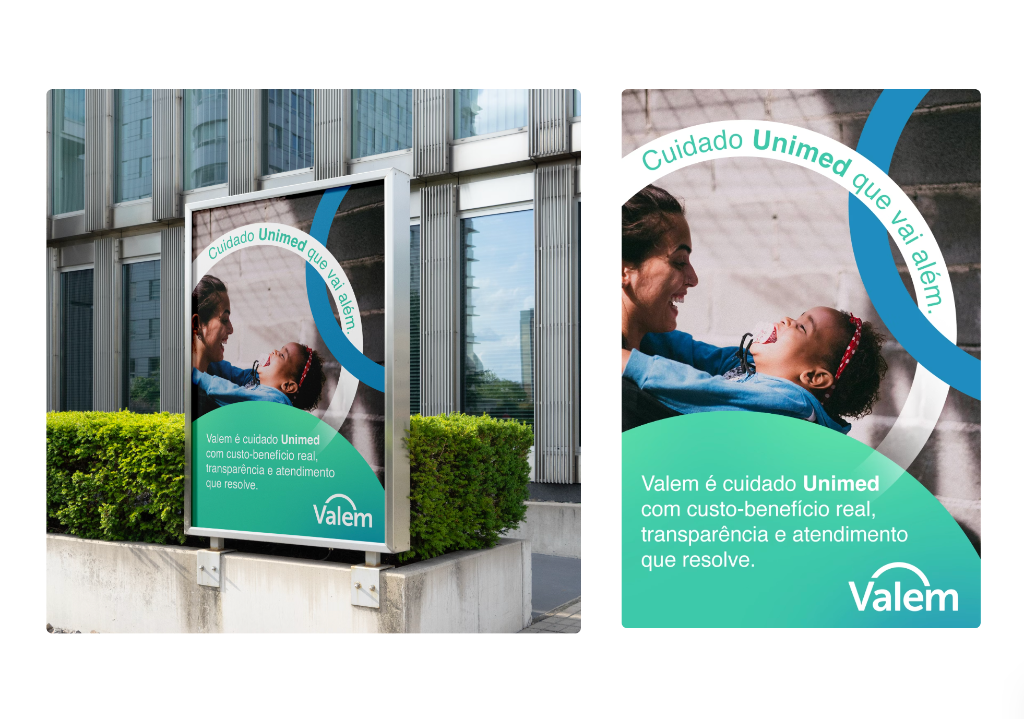
Voice · real piece
The voice explains before it sells. Empathy that keeps the system from sounding cold — without losing authority.
"The biggest gain was not just a new visual identity. It was building a strategic direction that aligns the entire company.
Valem's Value Journey
Valem acts as a strategic bridge, transforming each audience's pain points into clear and effective solutions.
"After this work, it became much easier to explain why Valem is different from other administrators.
Did you recognize your company in this case?
If the answer is yes, it's worth a conversation. No proposal on the first exchange — just understanding where the gap is between what you deliver and what your brand can communicate.
No proposal on the first exchange — just clarity on where the gap is.
© 2026 Vince Branding Co.

